Ethereum Classic @eth_classic
Block 25,347,544. Era 6, reward 1.6384 ETC, next reduction at block 30,000,000.
hashrate, block 25,347,544, blockscout154 TH/s
A visual identity for the Ethereum Classic rebrand
A real thing rendered as a phosphor wireframe on black. One hue, restrained glow, numeric markings and no words. This page turns that into rules for the mark, the colour system, the type and the imagery, and it prints as the PDF.
Drag the hue and chroma above, swap any of the three faces for another Google font, or hit Randomize for a pairing and a hue you would not have picked, and every value on the page follows. Copy link puts the settings in the address so a variant can be shared, and Export tokens copies the resolved values as CSS. Nothing here is final.
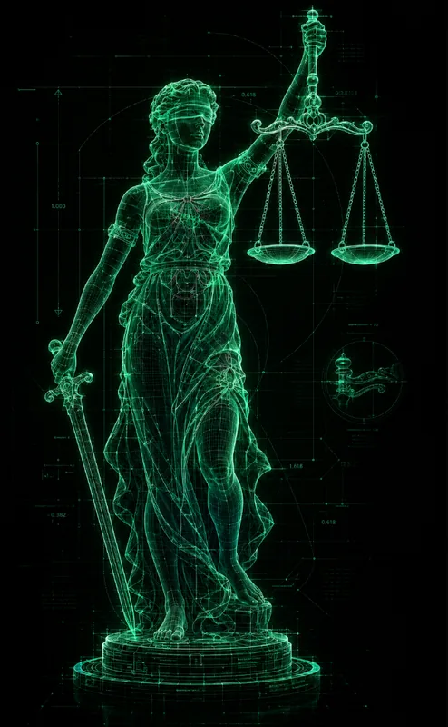
Ethereum Classic is the original Ethereum chain, still secured by proof of work, with a fixed supply and an immutable ledger. The identity says that without saying it. Everything is a blueprint of a real object, drawn in light on a black field, precise enough to measure from. Programmable digital gold, drawn as a blueprint.
Three ideas carry it. Original, so the mark stays the three-part diamond everyone knows and the wordmark stays plain. Measured, so every image carries construction lines and numeric markings, never slogans. Lit from within, so the subject is the only light source and the background stays black, in the same way the network is the thing that matters and the noise around it is not.
The style is defined by a prompt, reproduced in the imagery section, and every render comes from it. The mark is the one on ethereumclassic.org today. The type and the colour ladder are new, and are the parts this page is for.
One shape, three facets. It is the ETC diamond as drawn on the current website, used as the favicon there. It does not get redrawn. It gets a colour, a clear space and a minimum size.
Half the mark's width on every side, measured from the outer points. Nothing else enters that box.
24 pixels tall on screen, 8 millimetres in print. Below that the three facets merge.
ETHEREUM CLASSIC on one line, never broken. It ships as an outlined SVG so nothing depends on the font. Minimum width is 120 pixels on screen and 30 millimetres in print. Horizontal lockup. Mark on the left, mark height equal to twice the cap height, gap of a quarter of the mark's width, both centred on the mark's middle facet. Stacked lockup. Wordmark below the mark, gap of a quarter of the mark's height, both centred. Clear space for either lockup is half the mark's width on every side, the same as the mark alone. Mark and wordmark are always the same colour.
One hue drives everything. The accent ladder and the neutrals are all generated from it in OKLCH, so moving the hue recolours the whole system without touching a single hex, and the renders are desaturated and re-tinted with the same hue so imagery and interface never drift apart. There is one scheme. The sliders exist to refine it inside the green band, from lime at 120 to teal at 195, and the values below are what the current setting resolves to.
Two more colours exist, and they are the only two. Gold stands for the Bitcoin side of the lineage, proof of work and a fixed supply. Purple stands for the Ethereum side, the EVM and programmability. Between them they say what programmable digital gold means without a word of copy. Both are fixed hues that do not follow the slider, and both are used very sparingly. One marking, one keyword in a heading, one line in a diagram, the two pans of a scale. Never a fill, never a background, never on the mark, never in a render, and never more than one of each on a surface. A page with two gold elements has one too many.
Three families with three jobs, and any of them can be swapped from the toolbar to try a pairing. The display picker holds sixty-odd candidates, each shown in its own face, and any other Google font can be typed in. The current choice reads . A display face with some engineering in it for headlines, a neutral text face for reading, and a monospace for figures, labels and the numeric markings the imagery is full of. All three are open and on Google Fonts, so nothing depends on a licence.
Grotesque with squared counters, close to blueprint lettering. Already in use in the ethereumclassic.org rebuild.
Neutral and dense, reads at small sizes, disappears behind the content. The workhorse.
Every standalone figure on the page is set in this. Block heights, hashrate, dimensions on a render. It is what makes a figure look measured rather than claimed.
A real subject, drawn as a holographic blueprint on black. One emerald line colour that varies only in intensity, an X-ray of the subject's real construction, faint scanlines and construction lines, small numeric markings, and no readable text anywhere. The prompt below is the definition, and the phosphorize skill in the construct repo renders it.
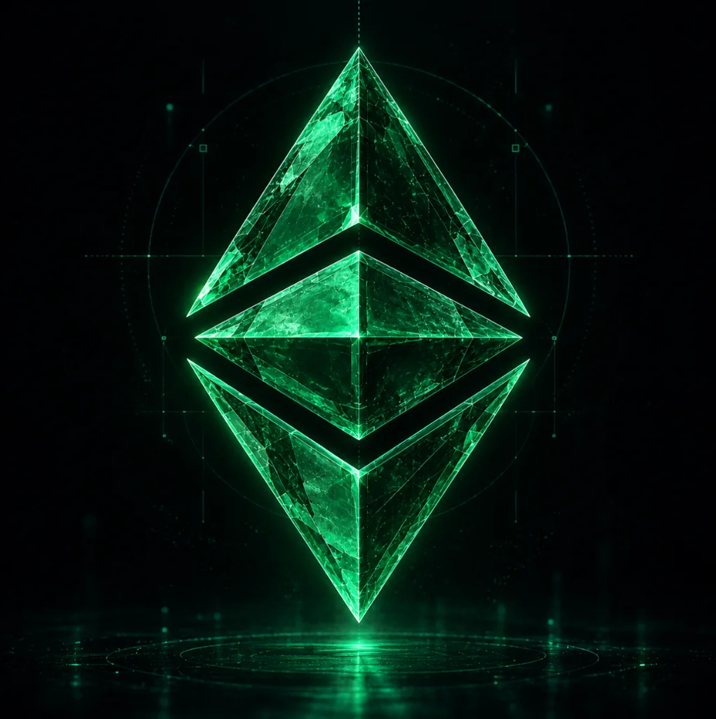
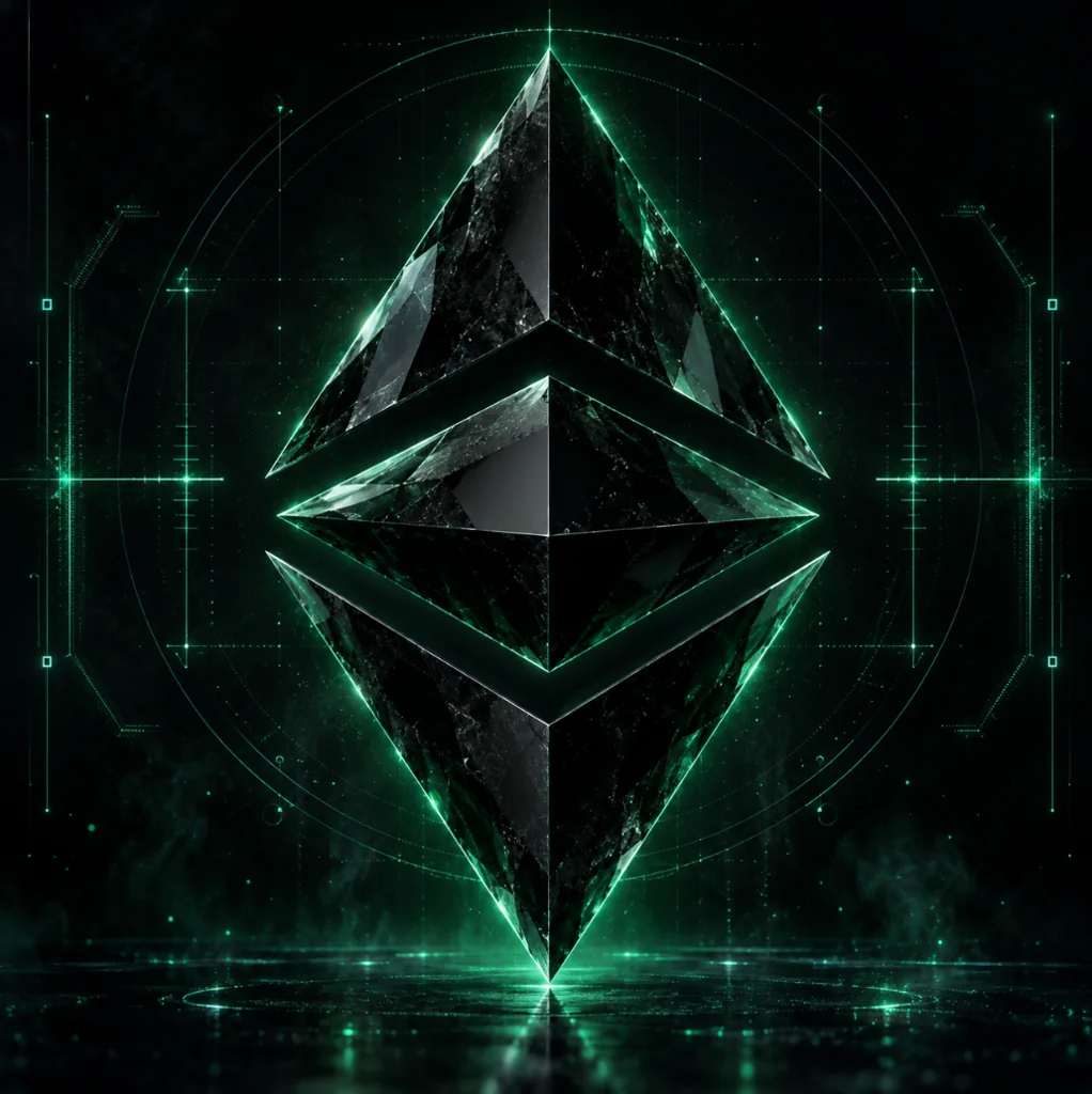
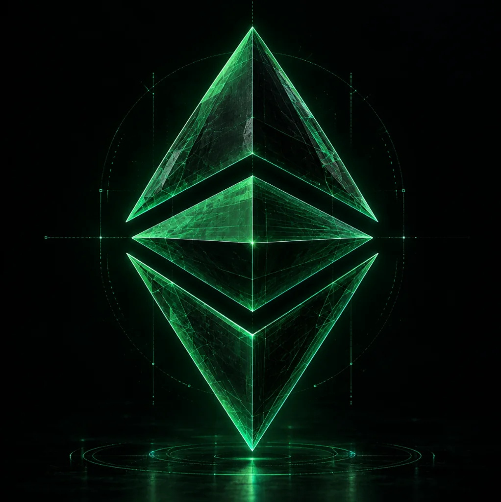
Five takes on the ETC diamond from the mill's library, all in the style. They show its range, a lit crystal on a floor, a dark gem in a HUD frame, a pure wireframe, a neon outline, and a faceted crystal. The wireframe and the outline are the ones that survive at small sizes.
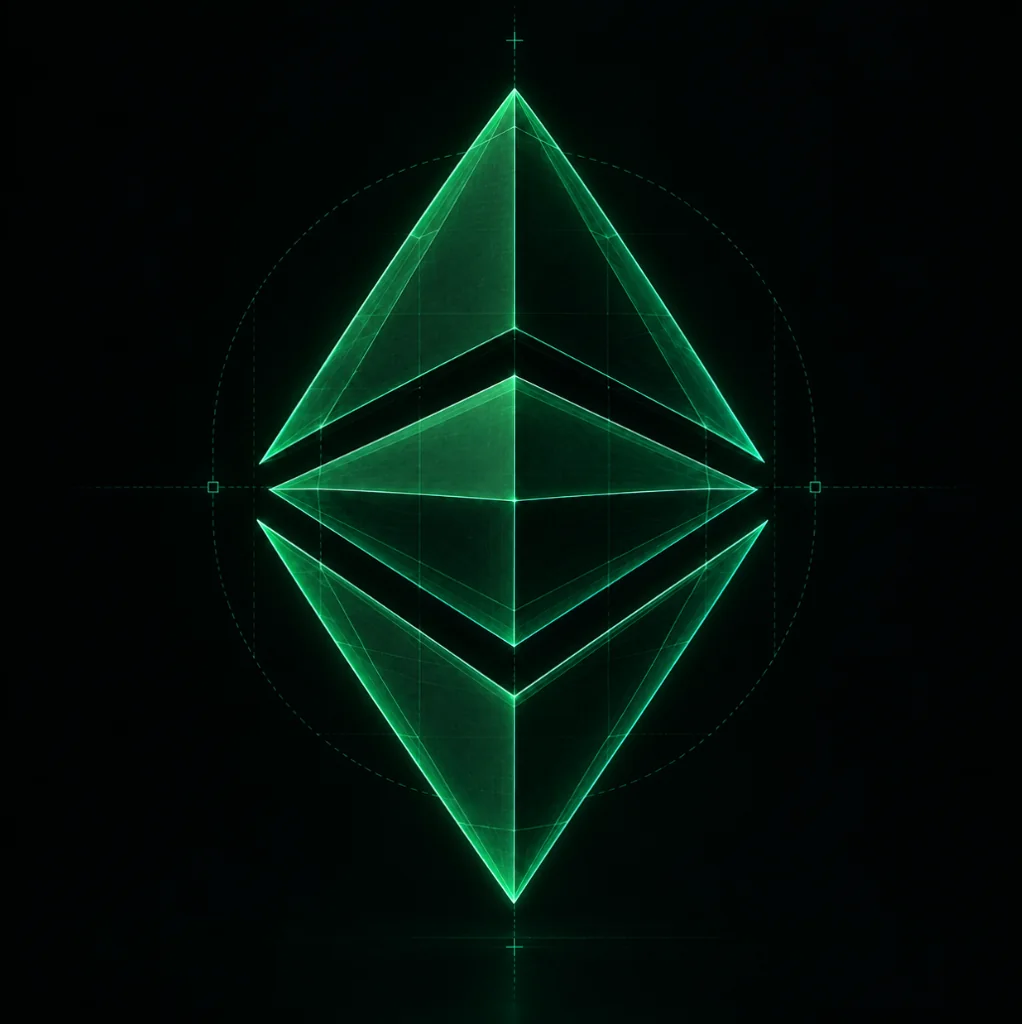
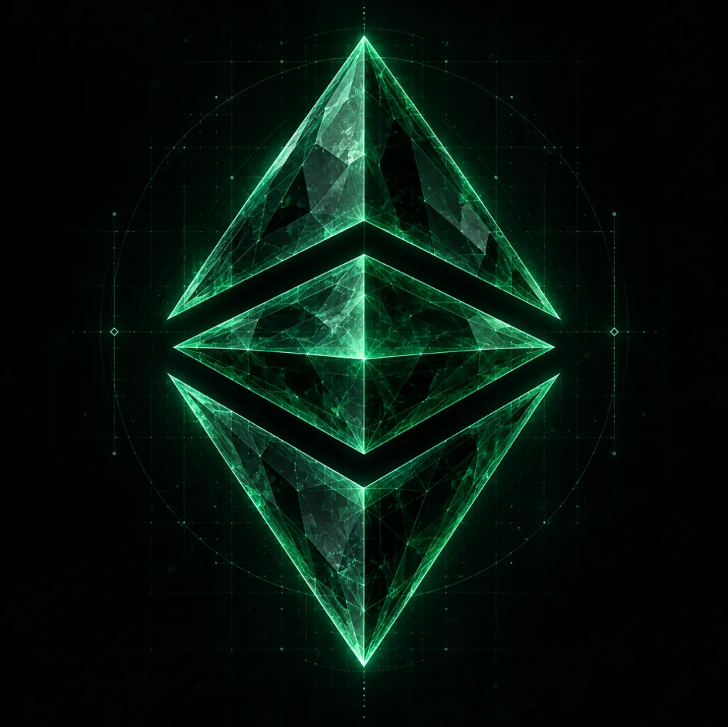
The reference piece. The original artwork, the 3D model built to match it and served as a hologram viewer at lady-justice.artifacts.classix.dev, and the same subject through the prompt. The third image is also the colour reference every phosphorize render is asked to match.
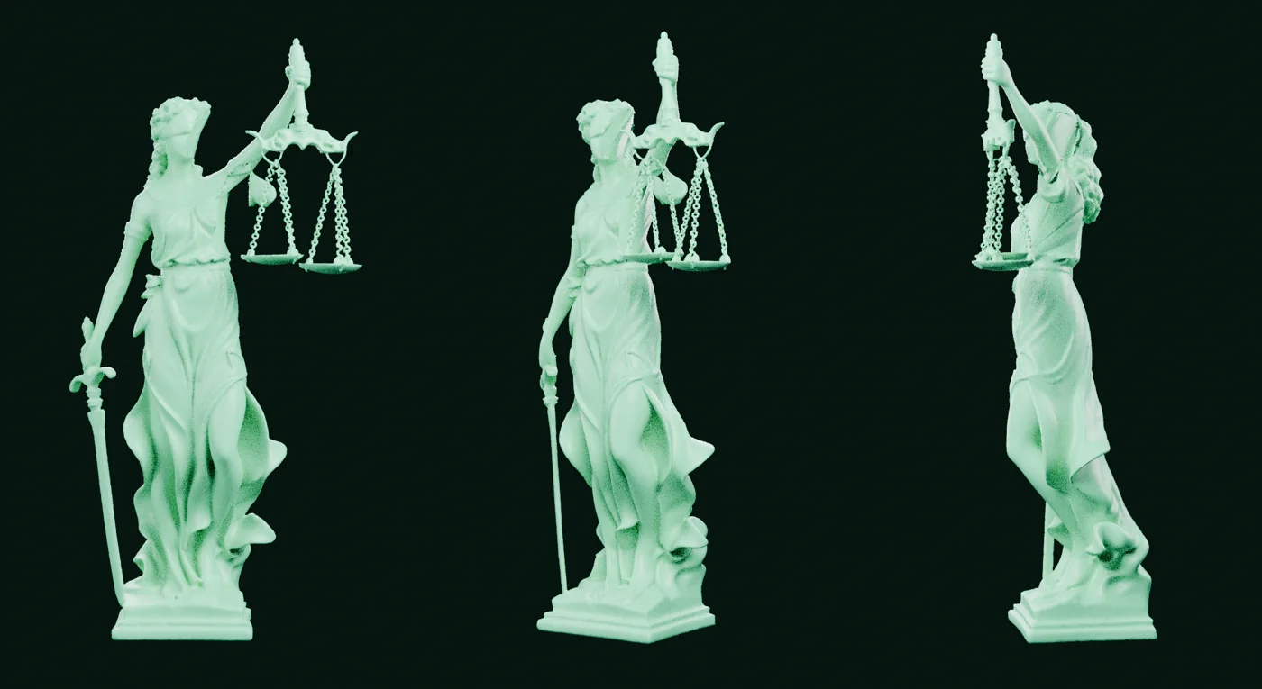
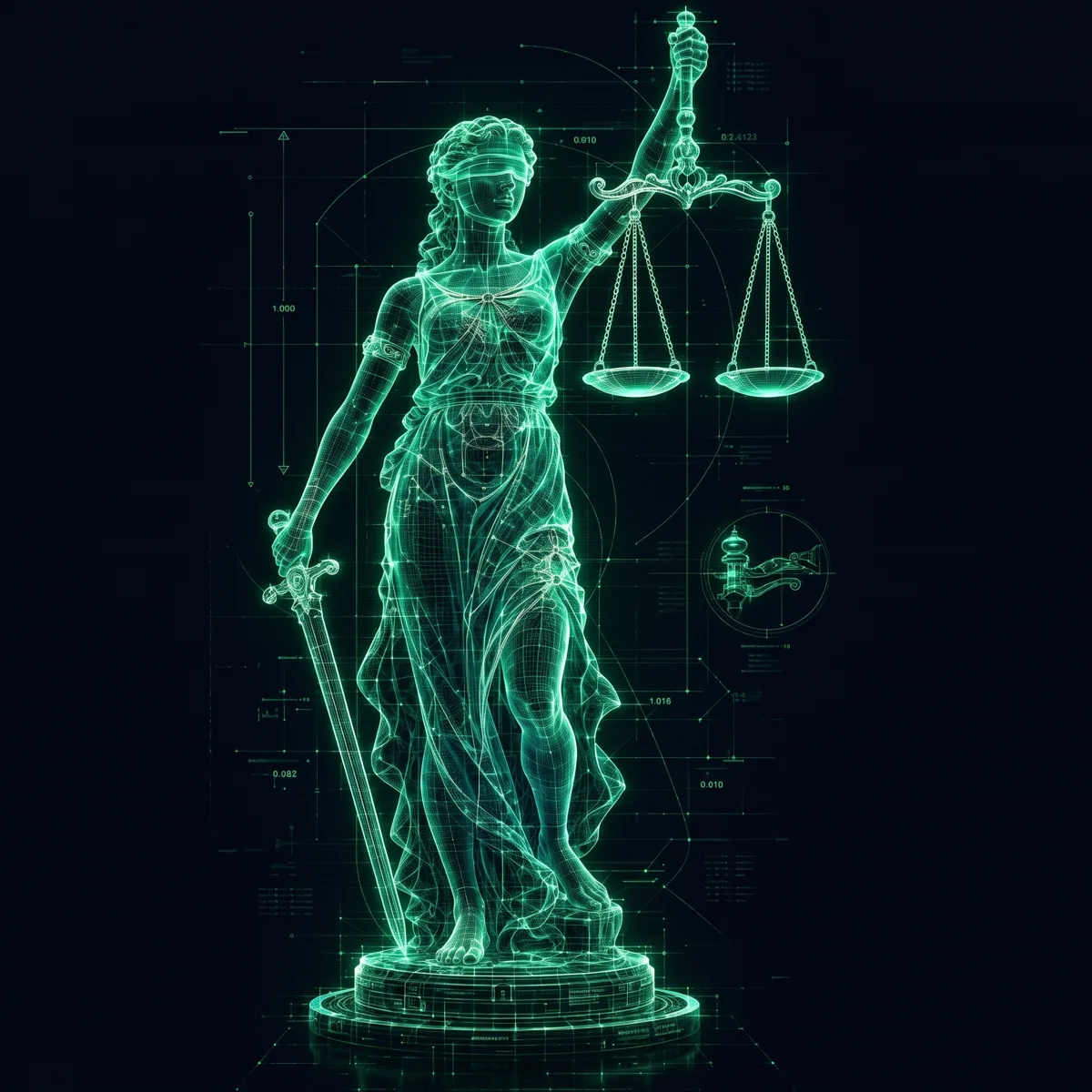
Verbatim, as kept in the construct repo at .claude/skills/phosphorize/phosphorize.md. The script fills the subject line and sends the whole thing to the image model, so this text is the style.
loading the prompt…
The same tokens on the surfaces the identity has to serve. They follow the scheme controls too. Figures on these cards are the chain head on the build date, sourced in the label. Placeholder numbers never ship.
Clients, ECIPs, the relaunch of @eth_classic and the OG Discord.
Add to calendarAgenda| Slot | Size | What goes in it |
|---|---|---|
| X avatar | 400 x 400 | Mark, accent on black, 60 percent of the side so it survives the circle crop |
| X banner | 1500 x 500 | A render alone. No mark, no words. The avatar covers the bottom left on desktop and phones crop the sides |
| X post image | 1600 x 900 | A screenshot with its source watermark and legend, or a render. Set type only |
| Discord icon | 512 x 512 | Same file as the X avatar |
| Discord banner | 960 x 540 | Render, mark bottom left inside its clear space |
| Open Graph | 1200 x 630 | Render with the mark and one line of set type |
| Shorts and vertical | 1080 x 1920 | Render or clip, captions burned in from the kit |
| Favicon | SVG, 32, 180 | Mark alone, accent on black |
The metric screenshot. An unretouched explorer or dashboard crop, source watermark and legend left in, block height and date set in the mono eyebrow beneath it. This is the weekly format and it needs no design. The upgrade notice. Fork name in display, activation time in UTC and client versions in mono, one link to the release page. Figure cards like the one above are occasional, never the backbone.
This page is the guideline. The controls at the top change the hue within the green band, the chroma, the mode and the three faces, and every value on the page updates, including the hex readouts, so a scheme can be tried and read off in one place. Copy link writes the settings into the address, so a variant can be sent to someone and opens exactly as set. Export tokens copies the resolved values as a CSS block and downloads the same with the settings as JSON, which is what the website should import. Print or save as PDF from the toolbar to get the document version, which uses light mode and starts each section on a new page.
The source lives in the construct repo under artifacts/neoclassic-identity. The mark is assets/etc-mark.svg, drawn in currentColor so it takes whatever colour it is given. The prompt is assets/phosphorize-prompt.md. The tokens are the top of style.css, and the website should import that block rather than copy values out of it.
Open questions. Where the hue and chroma settle inside the green band, and whether Space Grotesk or something with more edge carries the display role.
NeoClassic · identity draft · built 2026-09-15